Gestalt: The Study of Object Perception
Optical illusions might be fun to look at in your spare time, but they should never appear in a facility where information must be crystal clear. A misinterpretation of a label or sign could cost a life.
 Industrial facilities demand labels that communicate quickly, clearly, and completely. Early research into perception demonstrated how important graphic elements such as background, object similarity, proximity, white space, and contrast are to readability. German psychologists discovered in the late 1800s and early 1900s that our eyes don't necessarily see, but rather perceive information. The perceived information moves on to the brain where innumerable processes of classification, comparison, and decision-making are initiated.
Learning how to apply basic Gestalt principles correctly can help you design your labels and signs with the greater clarity and the legibility they deserve. Of all the graphic elements influencing perception, psychologists found white space to be among the most powerful. Insufficient white space is known to radically change perception and cause confusion.
"The design process requires a Gestalt (holistic) approach -- understanding the various environments where the sign will be situated, the cognitive load, and other perceptual factors such as noise, and other visual distractions," said Shimon Shmueli of Touch360.
Some of these principles -- such as the law of proximity, in which objects that appear close together in space are perceived as one group, and the law of similarity, in which objects that look alike will be perceived as one -- also have been applied in the design of mobile application user interfaces, according to Afrisa Yeung of Float Point Media.
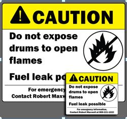
Small industrial labels and signs often lack sufficient white space. This is especially true when large text and graphics must fit within the confines of a small space. Messages may become blurred and even misunderstood, especially when workers must read them at safe distances.
"By contrast, some of the best designers in the world know nothing of Gestalt principles. They use them intuitively -- when designs look and feel right. Usually they incorporate Gestalt principles whether the designers knows the terminology or not. Gestalt principles aren't artificial constructs that people have concocted to apply to design. They are attempts to describe and verbalize how we naturally perceive things. It's arguable that design talent is an ability to naturally -- and perhaps even unconsciously -- understand how human perception works, and how to create designs for websites, paintings, or wedding dresses that are artistically beautiful and functionally efficient by appealing to it," said Michael Tuck of Black Max Web Design.
Giving your message ample room ensures critical facility information is accurately perceived. Imagine how much clearer a 10-step process or complex instructions for chemical hazard handling can be when messages are printed in big fonts and bold graphics.
When designing a label or sign, try to incorporate a pictogram into your design. The pictogram is known to be one of the most effective ways to convey information accurately and quickly. Large pictograms on big labels and signs are incredibly potent at delivering clear messages as long as the pictogram clearly describes a message and is simple to understand. Of course, large pictograms are better because they can be seen from greater distances and contain more white space to reduce confusion.
How Gestalt Impacts Labels and Signs
Sometimes called negative space, white space helps move the eyes' focus to stopping points of the message by creating visual pathways. Often, the more unused space on a label or sign, the clearer your messages. It's a concept similar to bullet points: They help break up large, daunting chunks of text into small pieces that the eye can quickly process.
 Familiar shapes, such as triangles, circles, and squares, simplify the communication process, which is why industrial labels frequently include these elements. A circle within a circle shows depth and proximity. When applied correctly, Gestalt techniques help a message say more in less space.
Pictograms are known to rapidly convey messages because they are designed with familiar shapes. The human form is one of the most familiar shapes. If we have a choice between the human form or background, our eyes will choose the human form.
Color is processed by the brain far faster than words, and can trigger an instant emotional response -- as red can trigger a sense of importance and urgency. When a variety of labels and messages are visible in an area and there isn't time to read them all, a solid color band is useful to indicate hazard level. This helps workers instantly assess which hazards merit the most caution.
There's quite a bit of Gestalt in industrial labeling, but more complex techniques also appear in many commercial logos. Have you, for example, paid proper attention to the "O" in OSHA? It's an intriguing optical illusion. It's an eye within an eye that looks right and left. Is the OSHA eye the eye that watches over the 130,000,000 workers employed at more than 8 million work sites around the nation?
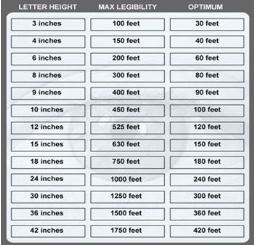
It's important to ensure the message can be communicated from a safe distance. If the sign requests that workers not come within 50 feet of a hazard, can the message be read from 50 feet away, from normal routes of approach?
Charles Austen Angell of Modern Edge Inc., a product design and development firm in Portland, Ore., summed it up: "It's all about effective communication. It doesn't matter what you display, it matters what people understand. Whether the object is a safety label or the interface on an instrument panel of an aircraft, solve the problem from the user's perspective and confirm critical communication through usability testing."
Posted by Jack Rubinger, Lisa Stringfellow on Jun 06, 2013