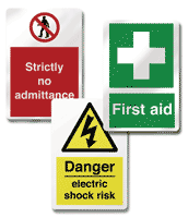
Increase Safety Awareness with Signs
Color combination is a vital component in all sign and graphic design and aids in all four of the basic sign design guides.
- By Drue Townsend
- Dec 01, 2007
The best way to
manage on-thejob
hazards is to
make sure every step is
taken to avoid them.
One way to help prevent
accidents is by utilizing
a safety signage
program to keep employees informed
and educated about possible hazards,
company procedures, and general
safety tips.
Each day, 9,000 workers require
emergency care for treatment of
injuries sustained while on the job.
Of those workers, 16 will die,
according to the National Institute
for Occupational Safety and Health.
From safety signs that remind employees
to wear protective eyewear to wellmarked
exits, equipment labels, and
decals that comply with Good Manufacturing
Practice (GMP) regulation, a wellplanned,
well-executed signage program
not only decreases the chance of workrelated
injuries, but also can increase general
productivity.
From construction and manufacturing
employees to public utilities and emergency
response workers, people within every kind
of service-related industry require clear,
informative signs to convey directional,
instructional, or safety information. Take a
look around. Over time, it is easy for work
areas and wall surfaces to become faded or
cluttered with various signs. Once this
begins to happen, the impact of particular
messages becomes lost. Important messages,
such as those regarding safety, should
always take precedence over others. Other,
less pertinent signs or graphics that may be
overshadowing or drowning out the safetyrelated
signs should be moved to a different
location or removed altogether.
It is vital to prepare for the unexpected.
For example, if there were an
emergency within the workplace, would a
visitor be able to easily comprehend his
location and exit the building? Directional
signage always should be unobstructed
and placed in locations that are easily
accessible from all viewpoints. The standard
for all exit signs is red letters, at least
6 inches in height, on a white background.
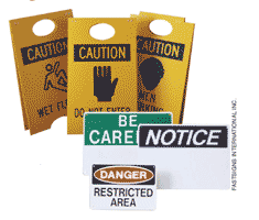
In industrial or manufacturing facilities where there is an increased likelihood
of injury, adequate signs are absolutely
crucial and required by law. Evaluate
equipment and make sure all machinery
displays proper warning messages and
safety reminders, such as “Protective Eyewear
Must Be Worn While Operating.”
And be sure the signs are located where
workers can easily view them.
Do operators
immediately see the warning sign as
they approach the piece of equipment? If
not, the graphic should be immediately
repositioned. These standards also apply
to any material that workers may handle
or come in contact with that can pose a
risk to them. According to the Occupation
Safety and Hazard Administration, containers
that house chemicals should be
adequately labeled for handling, whether
in the workplace or for shipping off site.
SUMMARY OF BASIC GUIDELINES
¦ Make sure the message is short and
simple. If it isn’t easy to read and understand,
it will not be accurately comprehended
by employees and increases the
risk of injury.
¦ Place the sign or graphic in an area
that is clear and accessible to an employee’s
line of vision. For example, if someone has
to bend over to see a warning message on a
piece of equipment, the graphic should be
repositioned.
¦ When using multiple signs in a small
area, avoid excess visual clutter that can
drown out and distract from important messages.
Make sure signs and graphics that
convey vital safety-related messages take
precedence.
¦ Determine whether the signage in place
complies with requirements put forth by
OSHA.
¦ Reevaluate your sign and graphics program
on a regular basis and make changes
as needed to ensure effectiveness. |
Four Factors for High-Quality Communication
Whether you are planning which signs
and graphics are needed or assessing
what is currently in place, remember four
basic sign design elements that will help
to ensure the highest quality of communication
within the facility or workplace:
visibility, readability, noticeability, and
legibility.
Visibility, a key factor to consider
when putting together a sign, is achieved
by making sure the sign’s lettering is
clearly distinguishable from its surroundings.
There are specific color choices and
graphic elements that can help a sign
stand out from background clutter that
can distract a viewer’s attention.
The concept of readability is what
helps to ensure the viewer not only reads
the sign accurately, but also actually comprehends
the message. To increase readability
from a distance, certain color
choices are best, such as yellow-on-black,
which studies have shown is one of the
easiest color combinations to read.
Noticeability refers to the characteristics
of a sign that draws the reader’s attention.
This can be easily accomplished by
changing the message, color, size, or
shape intermittently. For example,
research has shown that parallel signs are
missed significantly more frequently than
are perpendicular signs.
Legibility is achieved by making sure
the design of the sign enhances the distinction
of each individual
letter. Taking advantage of the
right typestyles and spacing
helps viewers read the sign
quickly and easily; the larger
the lettering on a sign, the
better its legibility.
Sign Design and Color
Another way to maximize the value
of a sign and the message it displays
is to add a border. The border focuses
attention to the sign and aids the viewer in
reading it 26 percent faster, according to
research done by the Pennsylvania College
of Optometry.
Finally, know that color combination is
a vital component in all sign and graphic
design and aids in all four of the basic sign
design guides. While still keeping visibility
and legibility in mind, consider displaying
any special information on the
sign in a second color, which will aid in
reader retention. According to a study
done by Kodak on color, using color
emphasizes important points and
increases retention by 82 percent.
Implementing a clear and consistent
standard for signage throughout the
workplace is essential to ensuring safety in
the workplace and benefits all parties
involved. There are a lot of decisions that
need to be made, and the process can
seem a bit overwhelming. A facility or
safety manager’s best source for advice is a
reputable sign and graphics professional.
Whether creating a completely new sign
and graphics program or reviewing signage
that is currently in place, you should
remember that the correct signage can
increase safe practices, possibly reduce
maintenance and insurance costs, and,
most important, keep workers safe and out
of harm’s way.
This article originally appeared in the December 2007 issue of Occupational Health & Safety.